top of page


LOGO DESIGN
Our Creativity Is Limitless
Our Branding Projects
Superior Fire
Doggo 411
Chin Jung Mom
BRANDING
Our Branding Projects

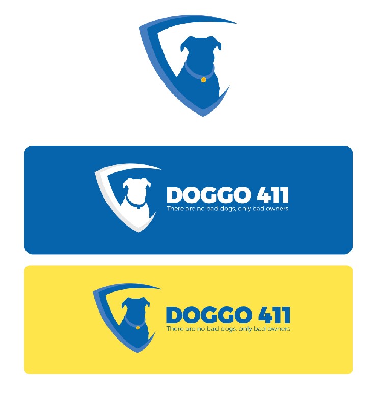
Brand Refresh Project: Doggo411 Logo
Doggo411, a beloved pet care company, approached us for a brand refresh to modernize their image while retaining the warmth and friendliness associated with their brand. Our goal was to create a logo that resonates with pet owners and showcases Doggo411's commitment to quality care.
Deliverables:
Refreshed Logo: A contemporary take on the existing logo, maintaining familiarity while introducing a cleaner and more versatile design.
Updated Color Palette: Soft yellow and cool blue tones were introduced to evoke a sense of tranquility and natural connection.
Brand Collateral: Redesigned business cards, letterheads, and packaging materials to align with the refreshed brand identity.
Social Media Templates: Custom templates for a consistent and engaging social media presence.
Goals:
To attract the attention of people looking for guidance of any kind having to do with their dog
• Help reach as many dog owners as possible
• Promote links, previews, and deals about subscriptions and service offerings
• Make the target audience feel confident that they can rely on the brand’s service to get the help they are looking for with their dog.

Branding Project: CXO Financial Logo
CXO Financial, a distinguished financial company, approached us with the aim of establishing a strong visual identity that reflects their expertise, trustworthiness, and innovative approach in the financial sector. The challenge was to create a logo that communicates sophistication while maintaining accessibility.
Deliverables:
Primary Logo: A sleek and modern design incorporating the initials "CXO" with a subtle nod to financial elements.
Color Palette: A harmonious blend of black and red accents, symbolizing reliability and prosperity.
Typography: Clean and professional fonts were chosen to enhance readability and convey a sense of credibility.
Brand Guidelines: Comprehensive guidelines outlining logo usage, color codes, and typography rules for consistent brand representation.
Goals:
• Promote financial literacy through financial education services
• Attract more customers through a compelling brand identity
• Increase revenue and organically expand market reach

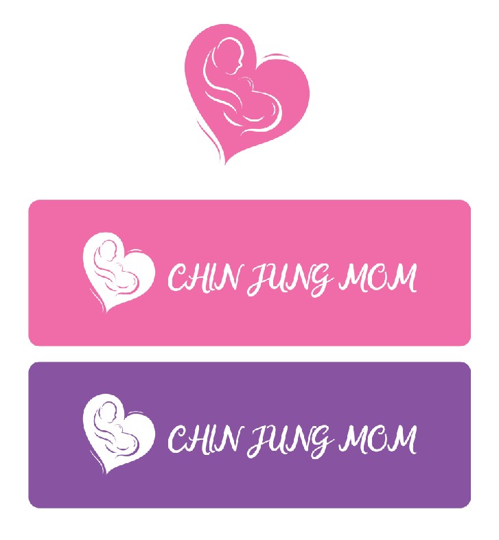
Program Project: Chin Jung Mom Logo
Chin Jung Mom, a Korean mom postpartum care company, approached us to develop a logo for their special event celebrating diversity and inclusivity. Our challenge was to create a design that reflects the rich cultural heritage of Korea and promotes a sense of unity among diverse audiences.
Deliverables:
Event Logo: A vibrant and inclusive design featuring elements inspired by Korean culture, celebrating diversity in motherhood.
Cultural Representation: Inclusion of diverse symbols and colors representing different cultural backgrounds within the Korean context.
Marketing Collateral: Customized posters, social media graphics, and promotional materials reflecting the cultural diversity and inclusivity of the event.
Accessibility: Implementation of accessible design principles to ensure the event's information is easily comprehensible to diverse audiences, including non-English speakers and those with disabilities.
Goals:
• To instill confidence of professionalism but still be able to have fun
• To communicate to the target audience that the company understands their financial concerns and that the brand is there to help teach them about financial education

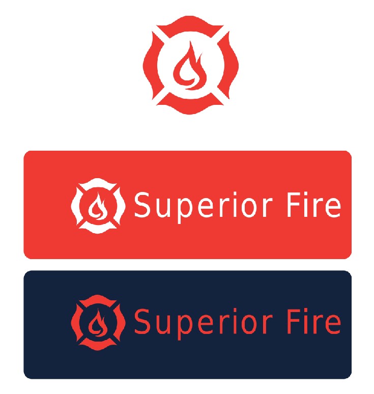
Rebranding Project: Superior Fire Logo
Superior Fire, a leading fire prevention company, sought a rebrand to align its visual identity with its commitment to cutting-edge fire safety solutions. Our challenge was to create a modern and dynamic logo that conveys both strength and innovation.
Deliverables:
Reimagined Logo: A bold and dynamic design featuring a flame motif intertwined with a circular shield, symbolizing protection and strength.
Updated Color Palette: Transition from traditional red to a gradient of fiery hues, emphasizing the company's dynamic approach.
Brand Messaging: Revamped tagline and messaging to reflect Superior Fire's dedication to state-of-the-art fire prevention.
Brand Style Guide: Comprehensive guidelines ensuring consistent application of the rebranded elements across all platforms.
Goals:
• Increase business revenue by attracting more customers
• Convince customers that the brand can assist them with their fire prevention needs
• Effectively market services by leaving a lasting impression through unique and memorable branding
bottom of page